


[VIE]
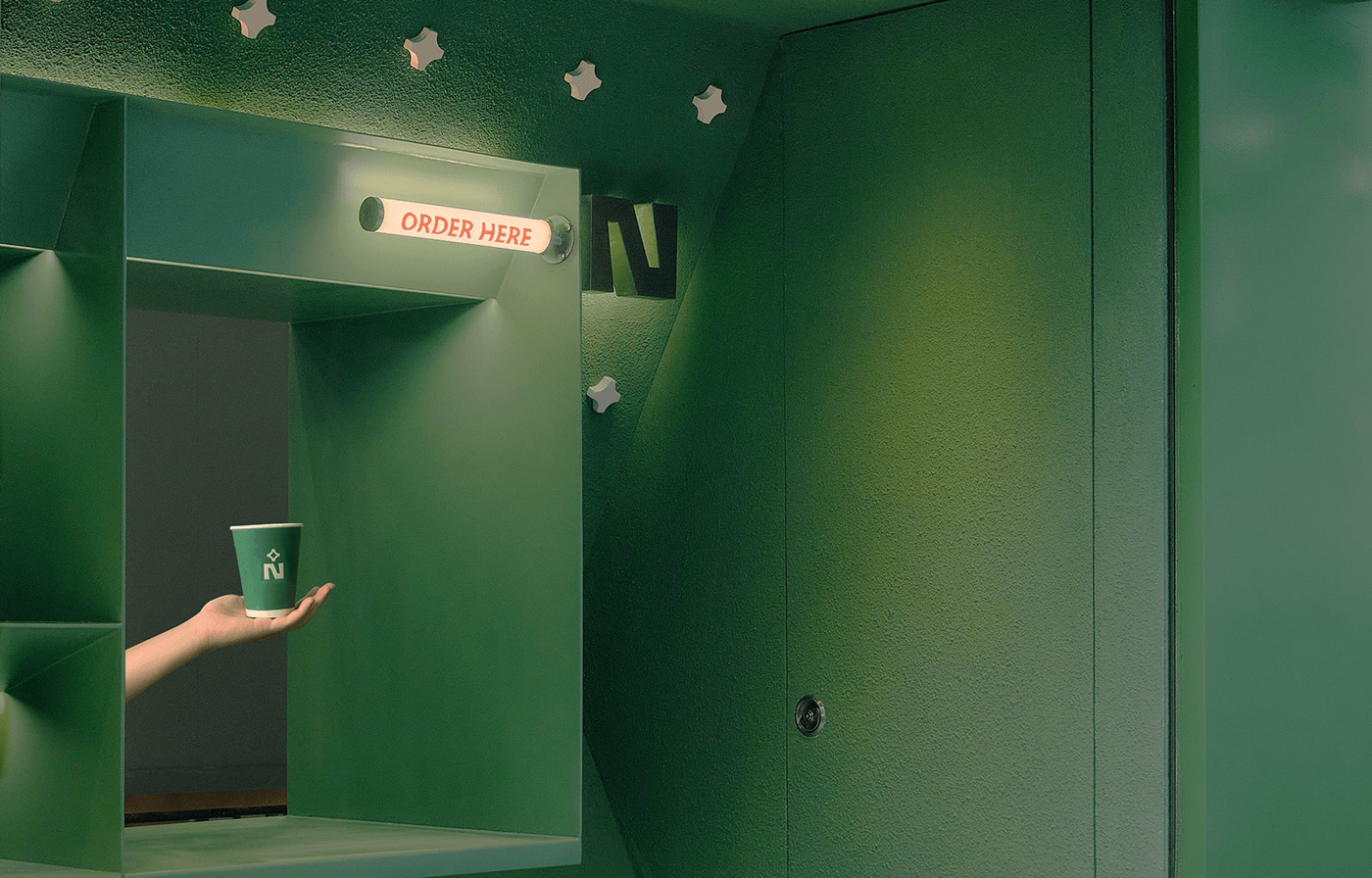
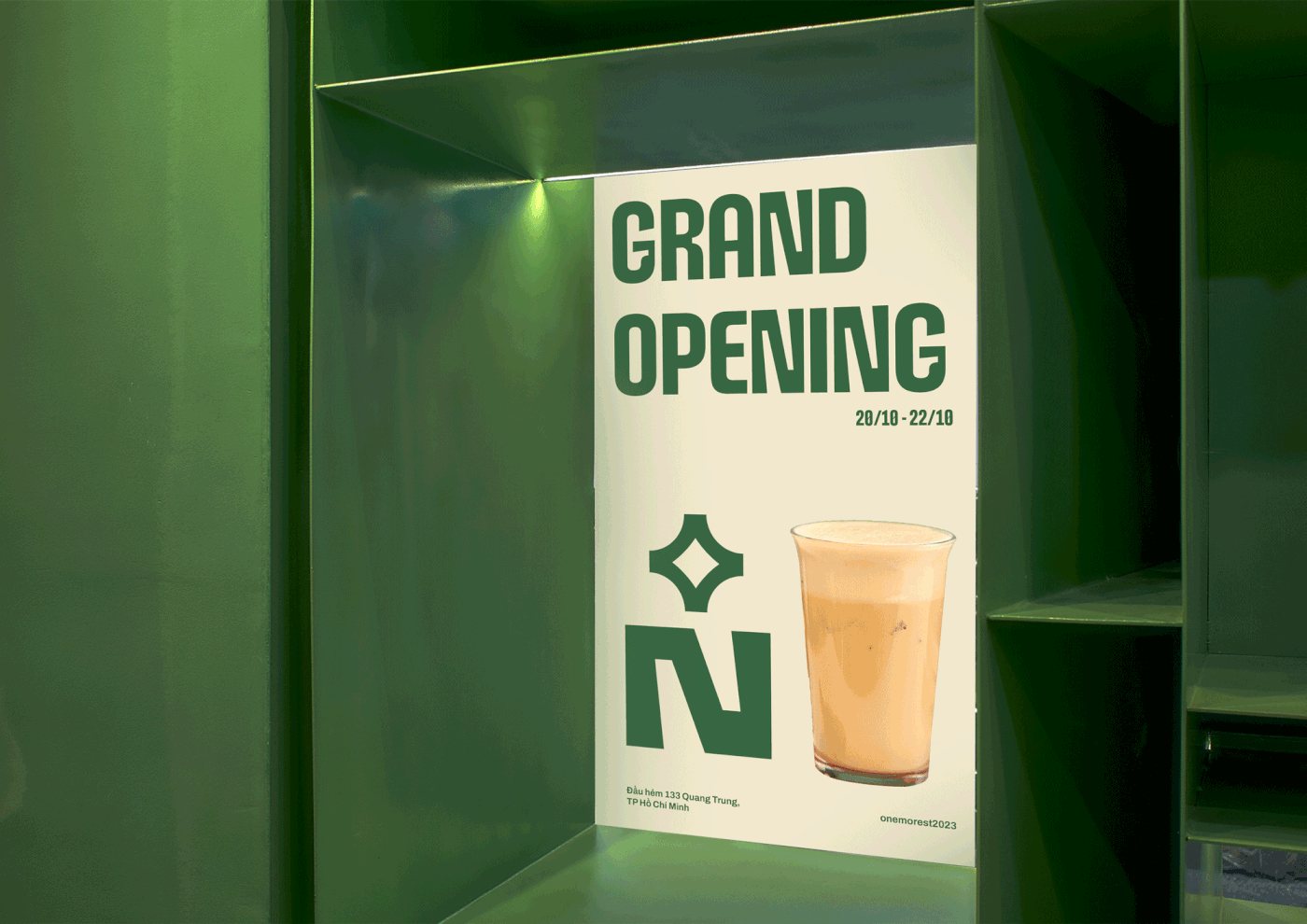
One More - Một cửa hàng take away nằm trong một con hẻm nhỏ đường Quang Trung ngay trung tâm khu vực Gò Vấp. Với vẻ ngoài xinh xắn và tông màu chủ đạo là màu “XANH LÁ” - One More muốn lan toả đến mọi người “GREEN ENERGY” nhằm tượng trưng cho nguồn năng lượng nông sản Việt. Thương hiệu tin rằng mỗi sản phẩm mà tụi mình mang đến cho khách hàng sẽ là một hành trình khám phá về hương vị nông sản của Việt Nam.
[EN]
One More - A take away store located in a small alley on Quang Trung street right in the center of Go Vap area. With a pretty appearance and the main color tone being "GREEN" - One More wants to spread to everyone "GREEN ENERGY" to symbolize the energy of Vietnamese agricultural products. The brand believes that each product we bring to customers will be a journey of discovery about the flavors of Vietnamese agricultural products.


Logo Concept:
[VIE]
N trong toán học có nghĩa là số tự nhiên. Mang ý nghĩa liên tục và kéo dài mãi mãi. +N đại diện cho sự tăng dần và vô hạn, biểu tượng cho sự phát triển cùng ý nghĩa tên One More. Chúng tôi đã lồng ghép sự cổ điển và phá cách hiện đại vào chữ N. Logo còn thể hiện hình ảnh chất lượng và con người đang thưởng thức đồ uống. Sự gắn kết của con người với đồ uống, trải nghiệm hương vị. N cũng là chữ cái đầu tiên của chữ “nhiều”.
[EN]
N in mathematics means natural number. Meaning continuous and lasting forever. +N represents gradual and infinite growth, symbolizing development and the meaning of the name One More. We have incorporated classic and modern twists into the letter N. The logo also represents an image of quality and people enjoying a drink. Human connection with drinks, experiencing flavors. N is also the first letter of the word "many".


Visual
[VIE]
Những hình ảnh họa tiết gạch bông và khung cửa song sắt của văn hóa Việt Nam đã truyền đạt cảm hứng cho thương hiệu và tạo hiệu ứng nổi bật cho những thức uống của One More. Tất cả cùng nhau tạo nên những yếu tố đồ họa độc đáo cho thương hiệu. Chúng tôi đã sử dụng từ '' Thêm" lấy từ ý nghĩa tên thương hiệu làm chiến dịch xuyên suốt các ấn phẩm truyền thông.
[EN]
The images of encaustic tiles and iron door frames of Vietnamese culture have inspired the brand and created a striking effect for One More's drinks. All together create unique graphical elements for the brand. We used the word ''More'' taken from the meaning of the brand name as a campaign throughout media publications.


Credits
Client: One More
Design form Ceris Creative
Creative/Art Director: Phước Thiên
Designer & Photographer: Phương Thảo


